This post was rescued from my old UX blog
Character limits are ubiquitous on the web, not least in applications that rely on user-generated content. Yet for something so common, character limits are often poorly implemented. Thankfully, by following six simple guidelines about designing length-limited fields and displaying character counters, you can make writing character-restricted text and smooth and painless as possible.
##In summary…
I’d give six key guidelines for designing a character-limited textarea:
- Avoid limits in the first place!
- Accompany character numbers with visual cues
- Show the character counter before the limit is met
- Let users overrun the character limit, then edit afterwards
- Make it easy to see what needs to be cut
- Offer other channels for users’ content
Let’s go through these in turn.
##Avoid limits in the first place!
Sometimes, we’re forced to limit characters because of technical or architectural constraints. That’s unfortunate, and difficult to work around. But other times, these restrictions aren’t necessary at all. Maybe the content is displayed in an interface we could rework to accept longer prose. Maybe we’ve made hasty assumptions about how users will structure their text. Maybe we’ve limited characters unconsciously, without thinking about it at all. Always see if there is an alternative to limiting your users’ abilities.
##Accompany character numbers with visual cues
How long is 200 characters? Can you visualize it in your head? How about 300? Forty? Abstract numbers don’t mean much to human beings, and it’s hard to guess what a particular character limit means in terms of prose upfront. That’s why it’s a good idea to provide users other cues to help them understand both the maximum length of the content, and where they are within those bounds.
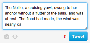
One possibility is to make sure that the character field is sized so that it roughly represents the size of the longest permitted text input. Whilst this is difficult to do with absolute accuracy (because 140 letter ‘i’s will take fewer lines than 140 ‘w’s), even imperfect respresentations will provide users an intuitive sense of the character limit. This is what Twitter does with its submission field, and who are we to argue with them?

Above: Twitter’s post box is roughly sized to the longest permitted post
Another technique is to change the colour of the character counter as the user approaches the maximum. Stack-exchange sites do this with answer comments, turning the number yellow then orange as the user edges closer to the limit.

Above: As a Stack Exchange comment grows, its character counter turns from grey, to gold, and finally to red
##Show the character counter before the limit is met
You don’t want a user to start submitting content only discover a character limitation halfway through. This would force users to rethink the content they’re entering in the field, and possibly the structure of other content they planned to submit also. That’s very costly, cognitively speaking. You also don’t want limit break error messages to surprise users, so it’s best to show the character count from the start. If the counter seems to clutter your design, consider displaying it in an unassuming fashion to begin with (e.g. in greys), slowly increasing its prominence as the user types more text.
##Let users overrun the character limit, then edit afterwards
Some character-limited fields refuse to let the user write any more text once they’ve reached their limit. This is bad practice for two reasons: firstly, it stops users from copying and pasting, and secondly, because it’s easier to write and refine text than to start editing content before it’s even written down. Letting users write their full text lets them get their ideas on the page, then start the mentally demanding task of copyediting their material.
##Make it easy to see what needs to be cut
As mentioned in point 2, above, it’s difficult for a user to know what a certain number of characters really means in terms of numbers of words. That’s why it’s useful to hint at how far the user has exceeded limitations some other way, too. If you sized your textarea to indicate the amount of content allowed, you’re already helping, but another idea is to actually highlight the portion of the user’s text that breaks the character limit.

Above: Here, exceeding text is red, so users can see what needs to be cut. It also ties the red error message to the text that triggered it
##Offer other channels for users’ content
If a user is breaking a character limit, it’s possible that they’re trying to use your fields in ways they shouldn’t be. You might, therefore, want to use character limit error messaging to refer to other channels or textfields that might be more appropriate for the user’s lengthy content.
In Facebook, for example, when users post excessive status updates, the error dialog suggests using the unlimited length notes feature instead. This pushes members using statuses for lengthy diary entries into using the dedicated journal system instead. If your user is breaking a character limit because he or she has simply misunderstood the purpose of a particular feature, this solution might help.