Form elements are notoriously difficult to style. Even apparently simple tasks like horizontally aligning different types of input can prove a headache for experienced developers. Only by understanding how form elements are laid out can we master them.
A simple task
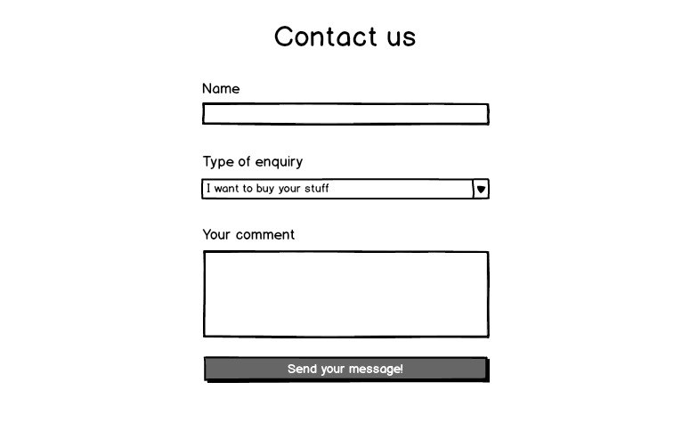
Let’s say you’ve been asked to implement a simple HTML contact form for a new client. They’ve handed you a Balsamiq mockup – it all looks simple enough.

An input, a select, a textarea and a button. The markup is dead simple:
1 | <form> |
The CSS should be straightforward, right? Let’s hardcode the widths to keep things really easy:
1 | form { |
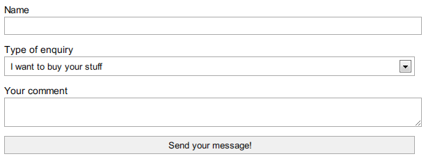
But this doesn’t work. Instead, you get something like this:

It doesn’t seem to make sense. After all, the form elements were all display:block, and I gave them width:auto for good measure. Shouldn’t they expand to take the full width of the container?
##Form elements have intrinsic ‘auto’ widths
Forms elements are ‘replaced’. This is a term you might have encountered when reading about images. Essentially, ‘replaced elements’ are items ‘alien’ to the browser items, displayed within it. Replaced items have their own intrinsic dimensions, and this defines their ‘auto’ values for width and height. Think of how display:block images don’t expand to fill their containers unless you give them width:100%. The same applies to <input>, <select>, <button> and <textarea>. They come from the operating system, so their ‘auto’ width is the OS default.
Though replaced elements have unexpected ‘auto’ width values, they can still be resized – again, just like <img> elements.
We can’t just put width:100% on our form elements, however, as they have padding and borders. We need to set a width smaller than our container, such that when the padding and border widths are added to it, it fits snugly into the form. That’s okay, though, we’re using hardcoded widths for this, so we can just set an arbitrary value of 590px to compensate.
Let’s try it again.

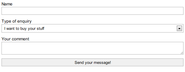
Almost – but the form elements don’t quite align. The dropdown and button are a good five or six pixels shorter than the input and textarea. What gives?
##Some form elements use the IE5 ‘quirks’ box model
As a front-end developer, you’ll be used to the W3C box model (so-called ‘content-box’). The ‘width’ property defines the inner box, with padding and borders added on top of that. You’ve probably also heard of the ‘quirks’ or ‘border-box’ model, where the width property defines the width of everything, borders and padding included. The quirks box model is usually dismissed as a historical artefact, last seen on Internet Explorer 5. Surprisingly enough, however, today’s browsers still use the border-box model for several form elements, due to historical reasons (and because the standards never really insisted otherwise). The misalignment above is the result of these two conflicting types of layout.
Form elements that use border-box include selects and buttons, whilst content-box (the traditional model) is used by textareas and text inputs. The content-box model is also used by the new HTML5 text input subtypes, like number and date. The only strange exception to this rule is input[type="search"], which takes a border-box model at the time of writing – but only in Webkit. Weird.
The fact that buttons use border-box is particularly irritating when they have to be horizontally aligned with buttons that are actually hyperlinks, and use content-box. The result is a shark-tooth effect that looks sloppy.
##CSS3 Box-sizing to the (cross-browser) rescue!
Use the box-sizing CSS property. Box-sizing lets you determine whether the selected item is laid out according to the traditional standards-compliant mode (‘content-box’), or the old-fashioned ‘quirky’ behaviour (‘border-box’). By setting form inputs to use content-box, pretty much everything from Internet Explorer 8 upwards will lay form elements out consistently, whilst older browsers will gracefully degrade to having a few form elements slightly shorter than others.
Knowing this, let’s try it one final time:

Sorted! The form elements line up perfectly.
##The box-sizing syntax
Here’s the cross-browser CSS:
1 | .selector { |
My advice? Place it to your next form reset stylesheet.