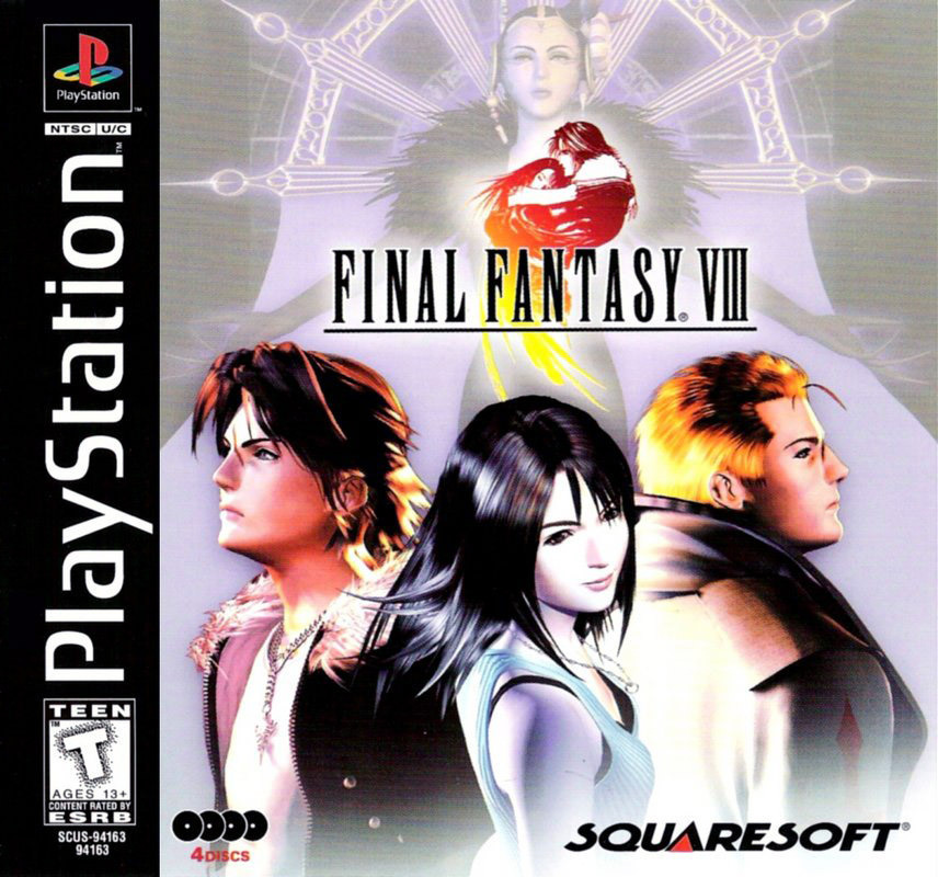
Final Fantasy VIII is a curious one.
You play a group of teens at a high-school-cum-military academy who spend their days planning prom dates, riding hoverboards and munching hot dogs at the school cafeteria. They’re training to become elite special forces, but have no idea their school is really a front for a millennia-long war against a time-travelling sorceress who wants to destroy all existence.
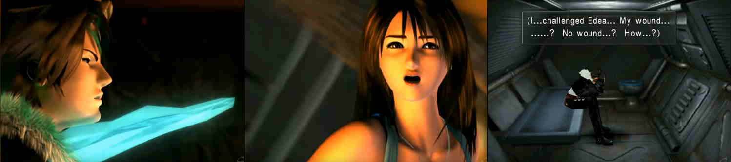
It gets… strange. You are mortally wounded and impaled in the chest at the end of Disc 1, then awake apparently unharmed. Everyone grew up together in an orphanage but forgot due to Plot Convenient Amnesia (discussed once and then forgotten). You fight a T-Rex in the school gym.
VIII can be maddeningly vague. Just who is Ultimecia, the sorceress from the future, and what does she really want? It’s never satisfyingly explained, nor how the sorceresses came about. There seems to be a link between her and your love interest Rinoa - with tantalising clues and strange allusions - but it’s a lacuna, an absence, like so many elements of FFVIII’s lore.
But a recent replay changed my mind. In fact: I now think VIII is the smartest and most self aware of the whole series. It has its faults and some bad writing in parts, but I think there’s a way of looking at FFVIII that makes sense out of the game’s weirdness.
I think that if you look at FF8 as a story about stories - a metastory - a structure falls into place. Like the game’s own time travel loop, this structure is a paradox, collapsing and uncollapsing on itself indefinintely. VIII tells a story about stories so dangerous, it has to abandon its own story in disgust.
I want to show you the real strangeness of Final Fantasy VIII.